I’m With… Seamless: Using promotional codes to drive ROI, fuel data visualization and deliver consumer insights

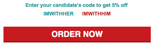
Whether you’re in the “I’m With Her” or “I’m With Him” camp, Seamless offered up an opportunity this past week to show your support and earn a sweet 5% discount off your order during this past Monday’s Presidential Debate.

As an avid and long-standing Seamless user, I am no stranger to their awesome deals they send through their email program; however, this one in particular grabbed my attention. Monday afternoon Seamless sent promoted a discount that users could take advantage of during the night of the debate. It would have been very easy for them to simply offer up one code, provide a 5% discount and do nothing more. However, the group created two codes where users could show their support to either of the candidates participating that night.

Screen Shot 2016-10-02 at 12.05.10 PM.png

Okay… so, what’s the big deal?

Rather than just letting that data lay around and doing nothing with it, Seamless sent a follow up email the next morning sharing the results of the promotional effort through a simple, yet effective data visualization. While there were likely tons of interesting data points that came out of this effort, the group did an excellent job of ensuring that the main point was well presented first before sharing other highlights.

Seamless Results from 2016 Presidential Debate Promo Code.gif

unnamed.png


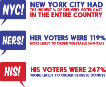
From a digital marketer’s perspective who also happens to be a Seamless user, I geeked out just a bit and then started thinking about what could be done with this type of information. It just so happens that 82% of the users who engaged with the promotional effort appear to be Hillary Clinton supporters while the remaining 18% were supporters of Donald Trump. My head immediately went to thinking about how this could possibly inform mobile advertising campaigns especially from an app-use re-targeting effort to reach those cohorts of consumers.

From a CRM perspective, imagine the benefits that Seamless can gain from these types of efforts! When thinking about the lifetime value (LTV) of their consumers, they are now able to add one more data point that would help them understand how they could potentially message to a user. For example, does the uptake and use of promotional codes tend to increase when presenting more than one choice or does it only work when tied to a culturally relevant event. Can you imagine all of the testing opportunities that exist? A message-testing matrix could fill up very, very quickly over the course of the next few months alone!

All in all, the proper use of promo codes can be handy for delivering strong ROI especially when using owned channels such as email and social outreach; however, continued testing can provide even greater ROI for the brand in the form of deeper consumer segmentation. Continued collection of how, when and where to connect with consumers is invaluable information that can fuel CRM efforts and serve as a stepping-stone to other avenues for building effective reach. Proper tracking, collection and coding can provide a platform for modeling and possibly the creation of a brand or organization-centric data management platform (DMP) for use in optimizing media buys and creative.

Beyond Hashtags: Upping Your Social Media Game for Enrollment (Presentation)

This year’s State of Enrollment Conference hosted by Enroll America provided an opportunity to connect with many of our partners from across the country to highlight best practices across a number of outreach channels to help drive awareness and get Americans enrolled in health insurance. One topic of interest for quite a few organizations happened to center around social media and understanding how to connect with people who may benefit from marketplace coverage.

Our session introduced a panel based discussion about some of the strategies and tactics that have been used within our organization as well as our partners, InsureGA and Out2Enroll. Below is an overview of the session as well as a link to the presentation:

So you’ve mastered the basics when it comes to Facebook and Twitter but now what? Whether you’re working with a shoestring budget or have some resources to invest, we’ll discuss strategies, tactics, and budget-friendly tools for leveraging social media to get the word out about enrollment from industry pros. All are welcome, but those who have used Facebook and Twitter before will benefit the most.

Beyond Hashtags Presentation: State of Enrollment 2016


Infographics: A Useful Tool for Advocacy Marketing  

We’ve all heard the saying, “A picture is worth a thousand words.” Well, that simple premise can lay the groundwork for many exciting advocacy campaigns. With so much data available to advocacy groups and the speed at which people want to find, digest and share information, infographics can be a powerful communication tool for campaigns.

First, the “Info”

Infographics are more than just cute drawings. They simplify complex data and help people visualize information in an accessible, engaging and memorable manner. Good infographics start with an advocacy group identifying and centering in on its single most persuasive idea (SMPI).  The best SMPI’s come from a combination of research and aspiration: what’s important to your audience and what compelling data do you have to share? The SMPI then becomes a driving force behind data sets, content buckets, storytelling and even design.

The infographic will likely evolve as the data story unfolds from further analysis. As you’re looking through the data, it’s important to look for stories that are newsworthy and intriguing. The hardest-working data is:

  • Substantial and concrete
  • Surprising and unique
  • Focused and emotive

Then, the “Graphic”

Of course, you need to think about the visualization of the data. How can the story be told from a visual perspective that drives your point home? It’s more than bar graphs and pie charts. A strong infographic provides a unique opportunity to tie the data back to the message in an expressive manner. It can be presented as part of a single visual (as in the infographic below) or animated into a video. The format all depends on your audience and how you want them to use it. Are you hoping they share it on Facebook? Integrate it into their own presentations? Either way, the more visually pleasing, the greater opportunity to increase share- and usability. Be sure to:

  • Keep the design simple and focused
  • Avoid heavy text and take advantage of great type design
  • Design for digital by making it shareable and clickable
  • Give it an intriguing title

An engaging infographic will provide an opportunity to connect your message with your target and potentially gain traction from an earned media perspective. However, the other big benefit to visual content is its ability  to improve people’s understanding and retention of the information being shared. Some research indicates that our brains process visuals 60,000 times faster than plain text. Plus, people remember 80 percent of what they see and do vs. only 20 percent of what they read.

brainprocessing

Now, Get It Out There

When it comes to helping people “find” your infographic, there’s no doubt that social environments are where this kind of information flourishes. Where does your audience “live” from a social perspective? What other outlets does your audience frequent where they can discover your infographic and position themselves as thought leaders by sharing? Don’t forget blogs and news outlets, which are always hungry for good content.

Finally, measure your success. Those re-tweets, re-posts, new followers and fans, inbound links and image loads are what will show you just how well your infographic does the talking for you.

Originally posted: December 18, 2014 (https://white64.com/infographics-a-useful-tool-for-advocacy-marketing/)